Guest post from David Hampton – Interaction Designer and Developer at Croydon Council
If you’ve read our previous blog posts about the Digital Inclusion Toolkit project, you’ll know that Leeds City Council and Croydon Council have teamed up in partnership with AgeUK Croydon and TechResort. Why? We have a joint mission – to share a wealth of existing information about Digital Inclusion in a collaborative way.
In this article I am going to talk about some of the design and development decisions that have driven the Toolkit’s first iteration in just 12 weeks.
The design brief
Having worked as a designer and developer in both the private and public sector, I can tell you the initial design brief for this project was very open. I’d say the first challenge for a designer in a collaborative project like this, is there’s no single client or service to aim your questions at. For me this meant I needed to put the right questions to the whole team, before starting prototypes or designs. To help build a consensus on direction. A more focused design brief.
We used Slack and sprint planning sessions to discuss these wider objectives. It soon became clear to me that the collaborators were all open to each other’s ideas and expertise. Thankfully they shared an overall vision from the start.
Here’s what we did know:
- There is a user need among councils and other groups, to find and share information about basic digital skills
- We want the information to be open, encouraging contributions and discussion
- The information should have a clear structure, be easy to navigate and search
- We need to publish content created by multiple contributors quickly
- We should develop something rapidly, within the constraints of the budget and team skill sets. We want to get something out fast, a first iteration that can be tested
- The content should be accessible and mobile friendly
Design research
As a team we went away and looked at various websites offering a similar proposition – presenting lots of detailed information in a clear way that’s easy to navigate. Some influential sites were Gov.uk Service Manual, dxw’s playbook, policies.google.com, PayPal and Wikipedia.
We talked about what we liked and disliked. Here are some of the things we liked:
- A focus on search and clear categories used for navigation on the Gov.uk Service Manual
- Tabbing between ‘Read’ and ‘Talk’ on Wikipedia
- A sticky menu of page contents that highlights your reading position in long pages, used on Gov.uk, dxw, Google and Paypal
So is it a Wiki, a website or a blog?
Before stepping too deep into design, being mindful not to design myself into any blockers in the development phase (I am the designer and developer on this project ). I encouraged the team to reach a decision on the platform early on. Although to some extent our choice was limited by the skill sets we have, a clear impetus was how open and collaborative contributions and discussion should be.
We explored a few routes. And thanks to TechResort we were able to fire up installations of these platforms for investigation.
Firstly we looked at CommentPress, a WordPress theme and plug-in designed to allow in page commenting at paragraph level. We decided this may be too detailed for us, we were looking for general discussion and contribution on the themes.
Not to take anything away from CommentPress – it does what it says on the tin. But from a developer perspective the complex UI potentially opens up a can of worms when accessibility testing.
Secondly we looked at MediaWiki, the platform that powers Wikipedia. Although designed for collaboration, we found the concept of a Wiki too open for us. Instead of any visitor being able to make new pages and live edits (like Wikipedia), we need more control over a content plan. To make the content as useful as possible to users we need to work with collaborators on a shared standard, in both content and style.
After playing around with an install of MediaWiki and looking at their Accessibility Workboard I was impressed. It’s an extremely powerful tool should you wish to create a true Wiki. The documentation is vast, and somewhat overwhelming at first. Saying that, if you put your mind to it you can get a working Wiki set up pretty quickly.
Lastly we looked at self hosted WordPress. We found some of the native WordPress publishing features suited the project goals. The built in comment functionality, and the user roles. From contributor users who can draft their content but not publish, to editors who can edit and reorder any content, and of course administrators who can set user permission level.
I have experience building WordPress child themes so I knew I could create something bespoke and fast, with limited days available each sprint and within the rapid turnaround for the first iteration. You can read more about the custom child theme I’ve created later in this article.
Based on the above we decided on self hosted WordPress as our platform.
Back to design
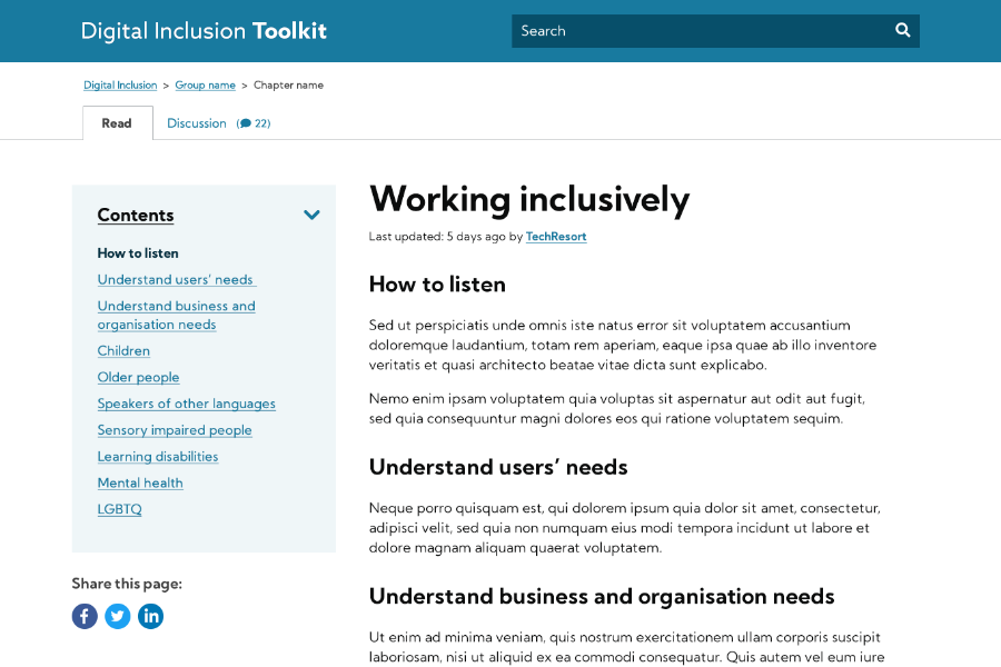
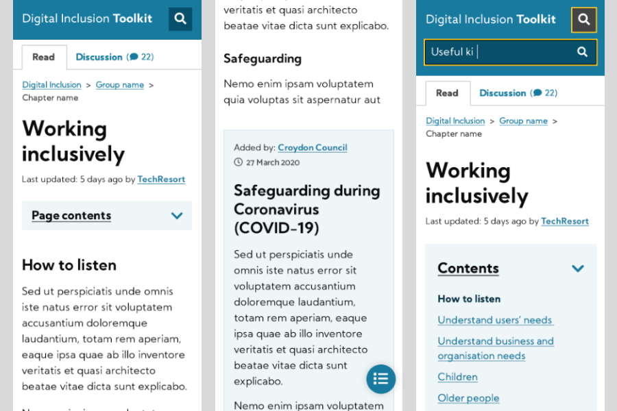
Now, with a steer on platform and a clearer understanding of the collaborative goals, it was time to begin prototyping a user interface for the toolkit. Based on the research phase I began drafting some mobile and desktop wireframes , first for the chapter content page. Designing in the features we liked – the ‘Read’ and ‘Discussion’ tabs, a contents menu, and a way of highlighting contributed content visually.
Time and resource permitting I start by hand sketching layouts then produce prototypes for user testing. All this before working on full colour designs. In this case due to time limitations, I worked up some basic sketches then moved to PhotoShop producing visuals that not only demonstrate the interface but the look and feel as well.
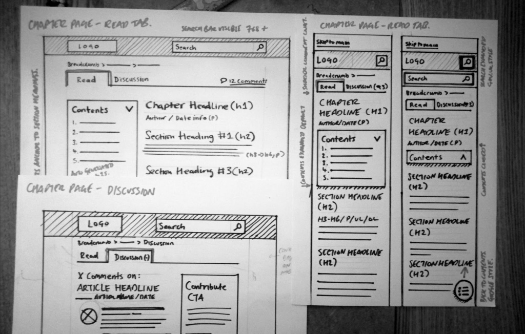

This approach echoes the way I began my career in commercial graphics and web design. We always produced visuals that are an exact representation of how the finished product will look on screen, with an aim for ‘sign off’. I also find this process useful for defining font sizes across mobile and desktop, as well as seeing the colour palette in action. I make tweaks to colour combinations during the design phase so they have good contrast levels for accessibility.
Of course there was no visual identity defined for the Toolkit yet, it’s a new thing. So I sourced a friendly, accessible web font and defined a basic colour palette for the first iteration. It’s simple but a good start.
I should mention my knowledge of best practice web patterns gained through working as a designer on local authority pattern libraries (Brighton and currently Croydon), plays an important role in my design process. I’m a fan of re-using design patterns that have been previously tested.
The toolkit has a handful of other page layouts, namely the homepage, search, and category pages. I’m still in the process of finalising some of the interfaces, and can say they’re heavily influenced by Gov.UK search, and the Gov.uk Service Manual landing page. Again, if it’s already been tested why not make use of it as a starting point to build on?
An open source WordPress theme
A bonus outcome for the Toolkit project is developing the platform in an open source way that can later be shared and improved. This drove my decisions on the choice of WordPress theme.
For the parent theme I chose UnderStrap and here’s why. Understrap is a free open source WordPress theme, it uses BootStrap 4 as a framework. It’s very bare bones and lightweight to use as a starting point for the front end, which I like.
It took me a number of years to come round to using BootStrap as a front end framework, in fact I never used it in my own projects until a few years after the release of Bootstrap 4 in 2014. Now I’ve invested some time in learning how to use it properly, I find the re-theming capabilities, grid system, and pre-made components an invaluable time saver in front end development.
To customise the functionality and look and feel of the parent theme I’ve created a Digital Inclusion Playbook child theme. I won’t bore you with any more intricacies of WordPress themes but here’s the exciting part.
Both themes can be installed in WordPress using one Zip file upload. If you have a front end developer available you can change the theme fonts and colour palette by amending a set of variables. Failing that anyone with a basic CSS understanding can change the look and feel using the advanced CSS option in WordPress.
WordPress out the box can be limiting in some ways, especially the search, so I extended some of the WordPress functionality:
- Improved search – to show matches relating to author and category names along with the chapter content
- Comments in a ‘Discussion’ tab – something I’ve never seen on a WordPress site before. If you have please let me know.
- Chapter headings and sections – Added as reorderable text blocks, simplifying the editing process
- An automatic contents menu – dynamically generated by content section titles (h2s)
Keep an eye out for an update on the theme release soon, we’re open to sharing and collaboration on the development side of the project too.
 100% Digital Leeds
One thought on “How we collaboratively designed and built a toolkit in 12 weeks”